Copycat Website Project
This project was a lot of fun to do, despite how stressful it was. Now, it wasn't stressful because it was difficult, I enjoyed the challenge, it was difficult because I had barely any time to work on the project, essentially starting it two nights before the project was due. At the time, I had many other projects I had to get done, and before I decided to complete those, I wanted to see just how much I could get done. In that night, I was able to partially complete the nav-bar, so I knew I would have time to do the rest. So essentially, I completed the entire page (including this one!) within one day.
My main goal with this project was obviously to see how much I learned about actually designing a website. This means that functionality didn't matter too much, just my understanding of organizing, and making elements work together to make an eye-catching page. Of course, having better functionality while maintaining the design I want would be much better for the project, but unfortunately, at some points I wasn't able to keep it. Either way, that functionality might not be needed.
So, what exactly in my project was missing functionality? It was my nav-bar, which when designing and editing at first, worked fine. The search-bar worked, and so did the buttons. However, later on, while creating the second div that goes below the nav-bar, the nav-bar seemed to lose it's functionality.
Now first, creating the nav-bar, which took up the most time. I noticed that the page had buttons that were clearly set apart quite a bit, mainly between the search-bar. I decided to try creating multiple lists that were all in the same area, but organized the same way as the Deloitte website. This involved using lots of positiong tags such as (top:#; bottom:#; left:#; right:#; and position:#;). The first big obstacle I came across was replicating the icons that I saw, such as the globe, phone, and chevrons. While looking for a solution, mainly for the chevrons, I came across one that required me to link a stylesheet, and upon further inspection I realized the link lead to a site that had all sorts of icons I could use, called Font Awesome! This site genuinely is pretty awesome, and I noticed that some of the icons used on the Deloitte website were exactly or really similiar to the ones offered by this site. However, the options that matched the Deloitte site's icons were locked behind a paywall, so I had to use the free alternatives.
In order to actually use these, I had to download a large collection of CSS files and a webfont folder, and upload them to the repl.it. From there, I could call certain symbols within my html, and custumize the color, size, etc. These were used several times throughout the project. Other than the icons, I generally had to relearn a bit of how to style nav-bars.
After this, I didn't really run into any major issues. I was able to position everything within the second div exactly as I wanted, as well as the third div, which were the articles.
Link to the project page
Link to the project files and code
Link to my planning page (only available to HSTAT)
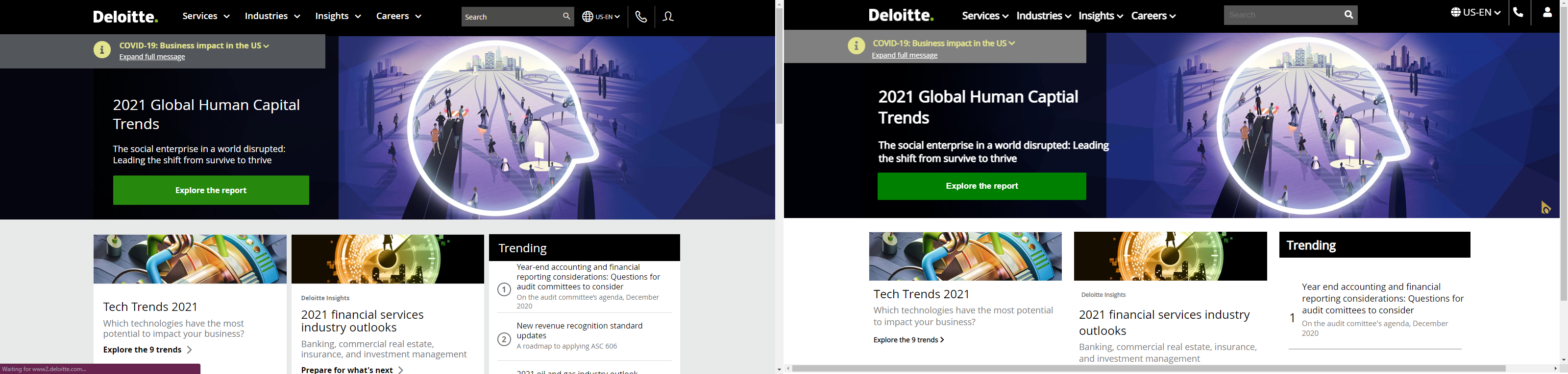
The Deloitte website on the left, mine on the right. Pretty similiar, huh?